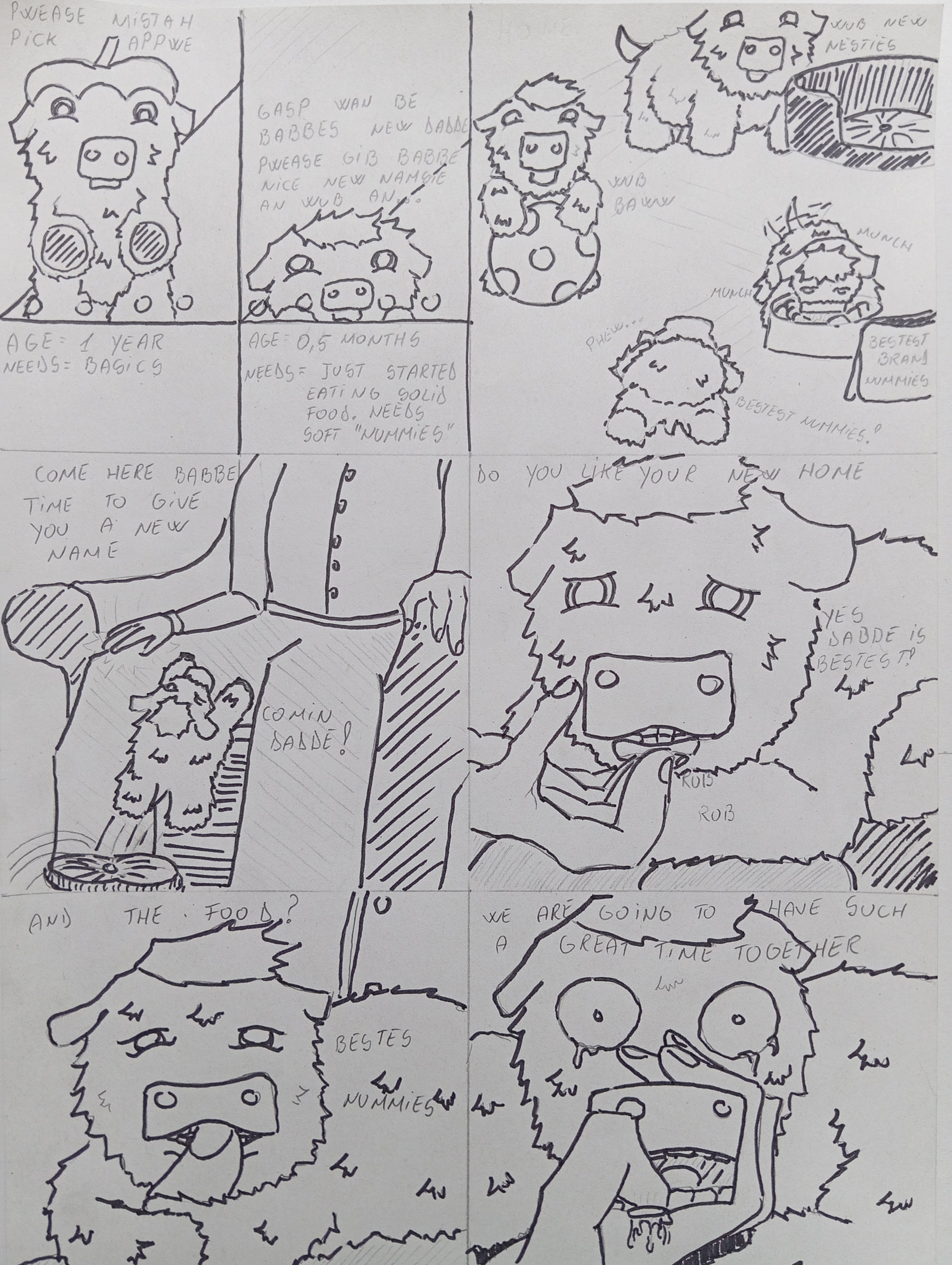
Experimenting with tracing over the original drawing to give it a bolder look. I hope you DON’T like it since it’s a pain in the ass and I don’t really like the “comic sans” look it gives.
33 Likes
Some clouds come with a shit stained silver lining.
2 Likes
love the lineart, <3
3 Likes
Either way, your style is good. This just makes it more distinct at a glance.
4 Likes
This is MUCH easier to read, thank you! I’m poorly endowed in the vision department, so this is a huge help.
Silly babbeh. He should have known better than be comfortable. There’s always a cost.
4 Likes
Its easier to read and to the eye. But you can always fix contrast on phone or pc
3 Likes
If only I were not in a constant state of “can’t be bothered” and which one is easier. I could mess with the contrast but truth be told this is easier. I’ll see how it looks when I’ll write a proper story. Maybe I’ll even add colour in the next story. Maybe, if I can be bothered.
5 Likes
Love it when Fluffies suckle on their owners’ fingers. Just an innocent way of begging for comfort.
5 Likes
I love the inking, but if I had to pick one or the other, I’d rather you ink the text, so it’s easier/clearer to read.
1 Like
Much easier to read!
1 Like
Reminds me a bit of The_Agony_Presence’s Patience is Rewarded comic. Cool to see your style develop.
1 Like