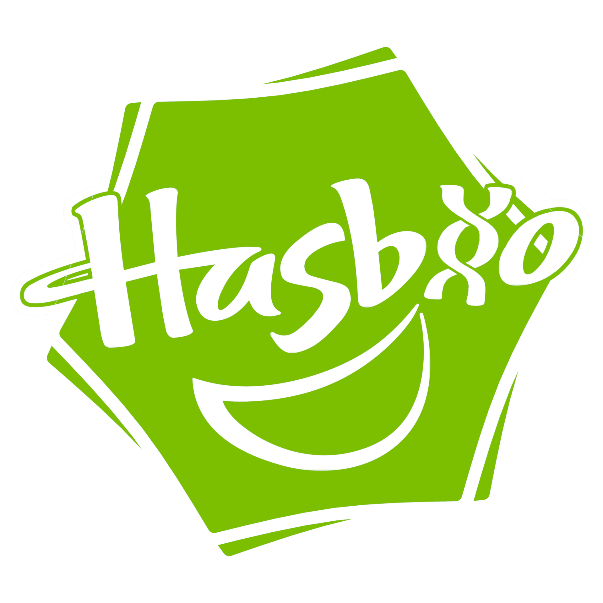
Not sure if anyone’s already made one but I had an idea and some spare time so here we go.
Getting the DNA to look like it matched the text was both really fun and really annoying.
I changed the shape to a hexagon because I thought of the diagrams for organic chemistry that we did back in school.
The colour change was just to really point out that this is different to Hasbro.
I would be open to criticism if anyone thinks there should be something different for a certain reason.
I can totally imagine a world where both genetic engineering advances and popularity of Hasbro’s My Little Pony line reaches such astronomical heights that a new division of Hasbro is created (dubbed Hasbio by those clever guys in marketing) that creates these inept walking talking shitting freaks of nature.
The shape is great and the double helix for the i is genius!
The only thing, and this is a complete and utter nitpick, is the smile. I feel like it should be replaced by something bio-toy or fluffy related, but at the same time what the hell would that be?
Some fluffy do have smiles that look like that
The only two constant with fluffies are shit and spaghetti, neither of which would fit pretty well.
Idk the smile just reminds me too much of hasbro at the same time I feel like it’s kind of the point.
That tiny detail asside the whole thing is amazing, the light neon green fits perfectly I can’t say why but it just does. And you’ve emulated the original logo’s design perfectly
It’s basically perfect, what I’m suggesting might fuck it up but if you could pull it off it would look PERFECT.
That little orange slice or smiley mouth shape or whatever that is, maybe flip it over and using as little lines as possible make it look like a fluffy somehow.
If not then leave it, it’s a 1:1 of Hasbro, it’s great.