constructive criticism is welcomed; but, please dont say that it looks like shit and then not mention what I can work on or how I can do better; I am simply attempting something that a close friend showed me to become better artist.
A huge thanks to everyone in the chat! Your support and encouragement have given me the confidence to step out of my art comfort zone & learn the techniques from my best friend to hopeful approve my art.
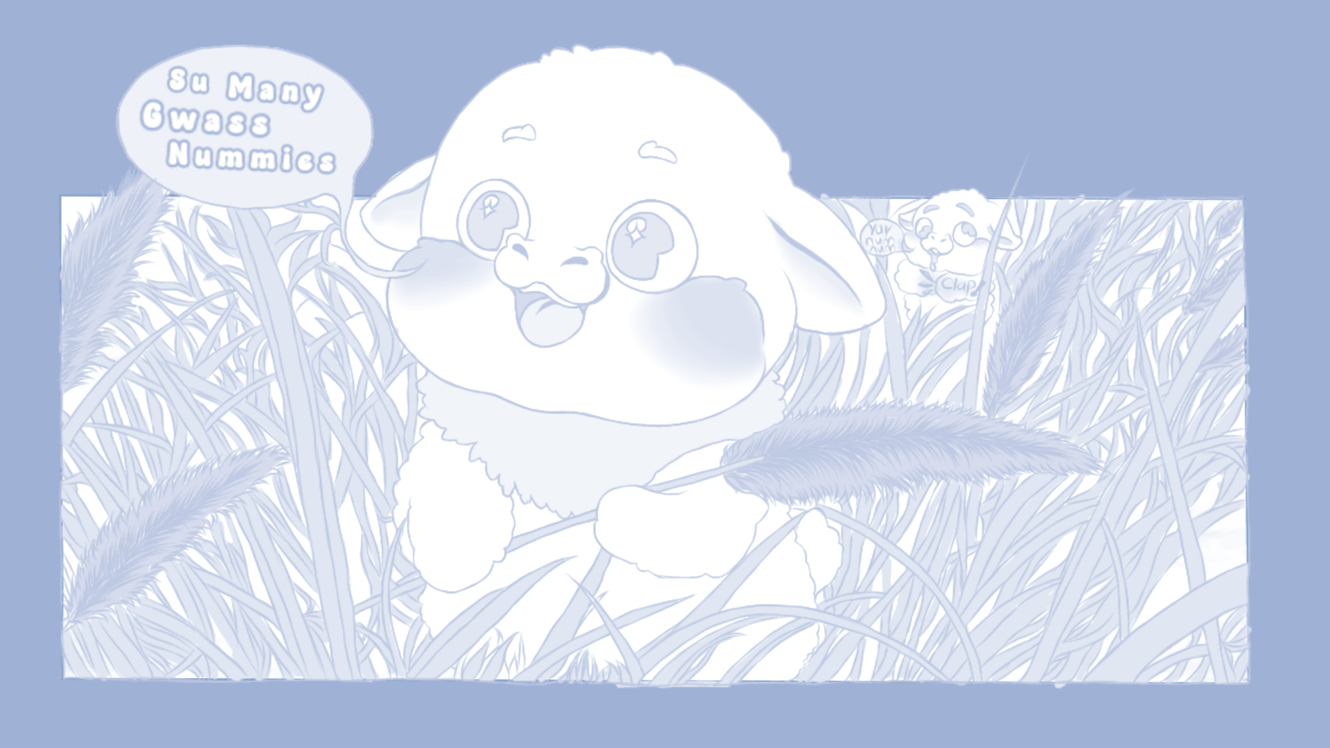
I don’t like how some of them turned out in the end, but I did my best to make them look decent.
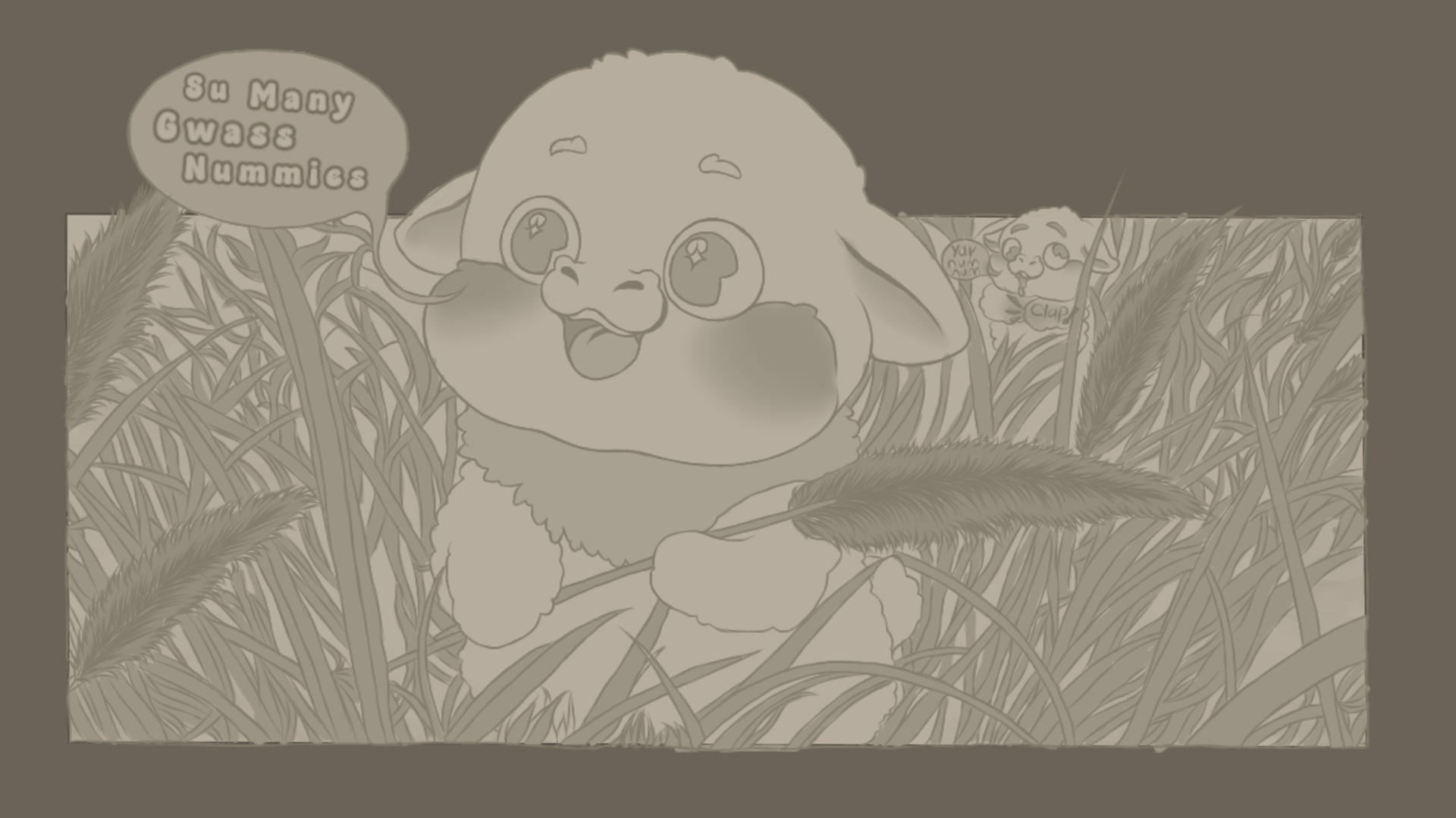
Original Image greyscale just like in old cartoons:
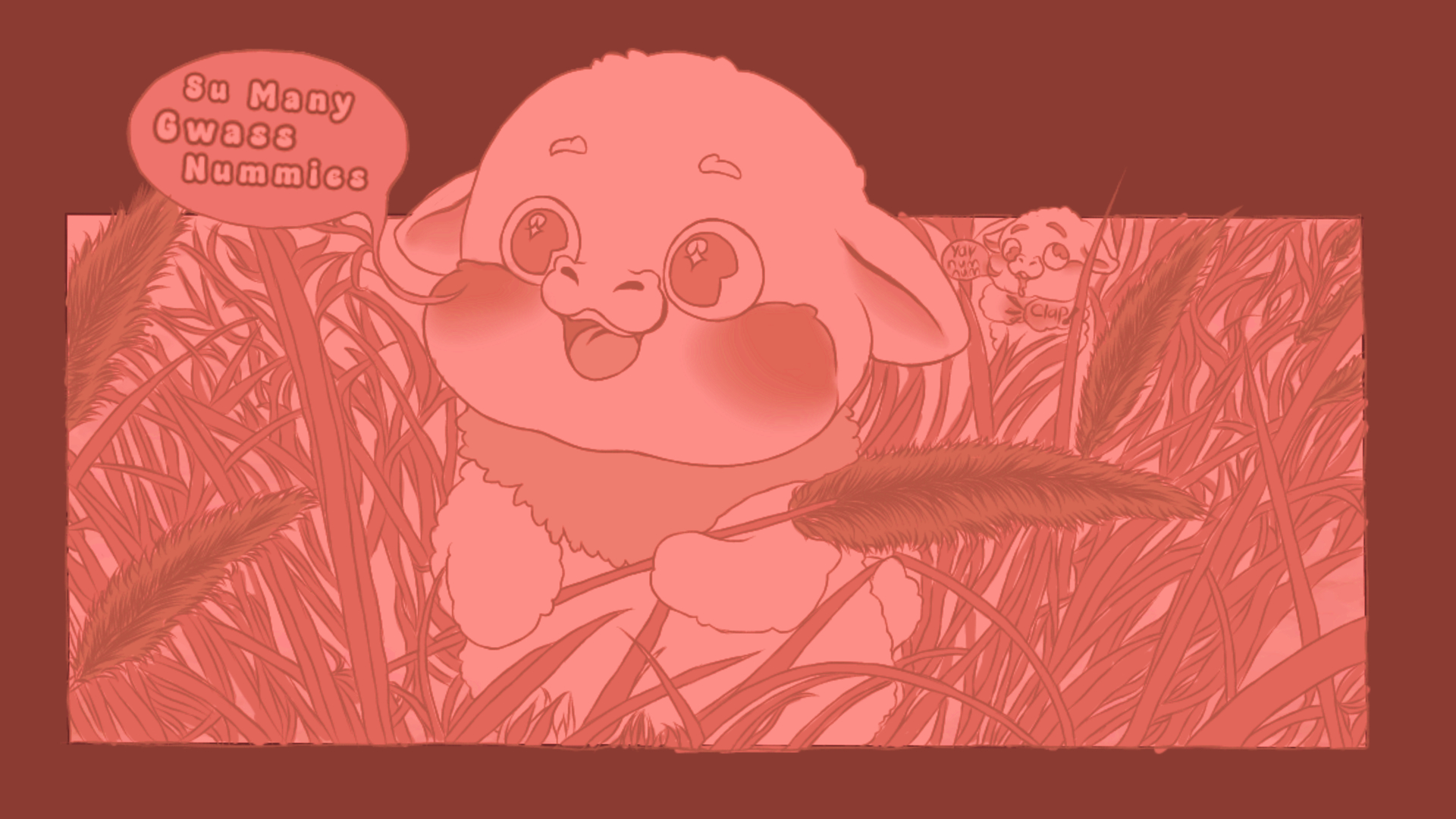
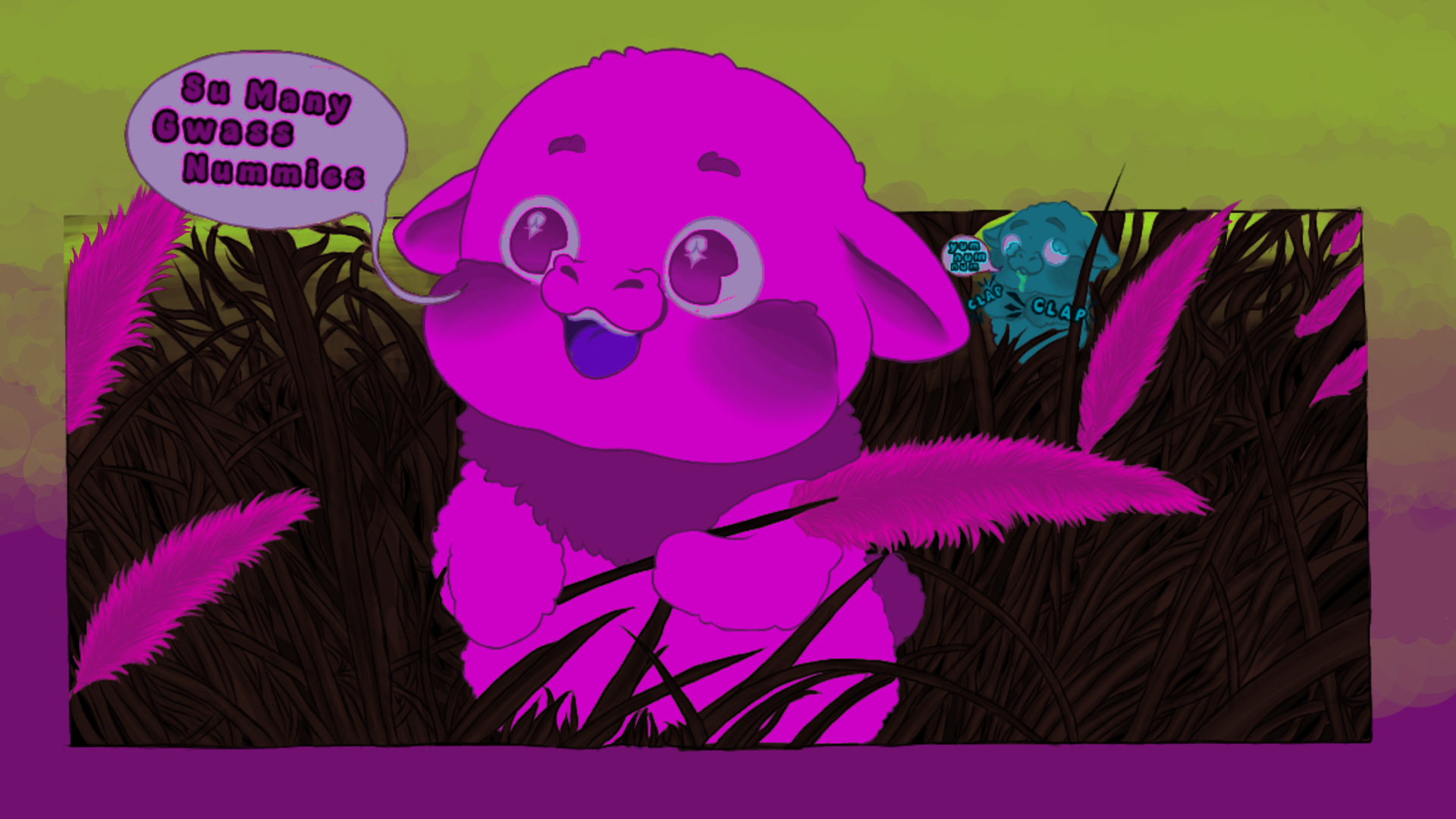
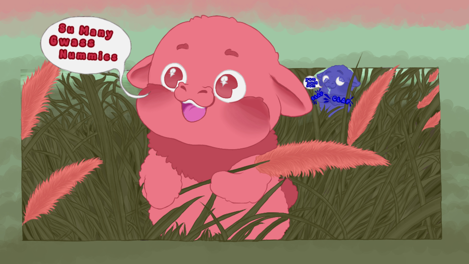
I think my favorite two are the purple scale and the fruit colours. They’re easier on the eyes and I don’t miss out on the small details of the grass and the derpy foal in the back. Beautiful art all around, and I adore the shape of your fluffies!
I agree with FluffyChimera on the color scheme, the purple’s nice and the fruit isn’t too vivid while still showing excellent quality detailing. Find your style and settle in, we love to have you here. Just make sure to find that balance between joyous bundle of childlike wonder and brittle shit-caked freak of nature. I’d say the lovely creatures at hand don’t fully capture the spirit of what fluffies are but they’re marvelous in their own right.
You know what they sorta remind me of cherubs in a way. Also, take my advice with a grain of salt. While I’ve been here a while it’s also 1:50am and I’m not an artist myself. So long as you find it enjoyable, keep drawing!
Oh wow, it took me until the fruit color one to tell there was a second foal in the back! Lookit that little derp! The colors are super pretty, I like how vibrant and out-there the neon one is, and the fruity one looks awesome!
And my condolences for your kitty… I know the pain. At least she had a good life, and felt safe enough to pass away at home instead of slinking off to die in the wild.
Thank you, honestly. I’m just trying to take it one day at a time and Cope with all of these overwhelming emotions through drawing and listening to music.
I like it! I’d say the reason fruit scale resonates so strongly is the contrast. Any of the other scales can be brought to this level, but the difference between the darkest and lightest isn’t big enough. This results in the grass sort of blending together.